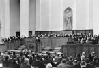
Several photos of family heirlooms from the ancient Slavic period, presumably 1000 AD, have been posted on the Internet, confirming the existence of the ancient Rosy state in the central Slavic, Vistula-Dnieper region, which Academician Boris Rybakov paid attention to.
On metal products various shapes, vertical ligature, velesov, the style of "cursive writing", characteristic of the tablets of the Veles book, various methods, the name of the ancient Slavic state is cut out - ROS.
The form of the vertical presentation of the word indicates one feature - the image has a symbolic and symbolic meaning. In this form, the word is perceived as a kind of emblem or brand, symbolizing the ancient Slavic state.
To fully decipher the Veles inscription ROS, it is important to understand the sacred principles of the Slavic Veles inscription, to know the rules for creating Slavic sacred abbreviations-concepts.
These conditions and rules for the velesic alphabet are laid down in the principle of its construction, linking each individual sound with each individual letter, without a hint of dual reading or dual pronunciation of the written:
- a single sound should correspond to only one single letter (sign)!
- a single letter (sign) must correspond to only one sound!
That is, the main condition for sacred writing should be a strict unambiguous transmission of information: all sounds and letters should be clearly interconnected and not have hints of semantic discrepancies or ambiguity of pronunciation.
It was these principles that allowed the Holy Fathers for thousands of years to use the unique Velesic script for sacred coding of sacred texts, for word formation, for compiling special words-abbreviations with a deep spiritual meaning (by grouping the first letters of the words used).
Sacred words served to glorify the Creator, Rule (the law of the Creator), Light Iriy, the souls of glorious ancestors, not only in prayers and service, but also in everyday life.
Therefore, the language of the rahmans and sorcerers, filled with sacred abbreviations, encouraged constant contact with the higher light forces, glorified them.

Cyrillic, created by Cyril and Methodius at the direction of the Byzantine emperor Michael III in the 9th century. n. e., surprised the Slavs with a heap of a significant number of letters, in some versions up to 54 characters!
It extremely complicated the written reproduction of the Slavic sound range - several letters could correspond to one sound in it. Sometimes there were up to 4 or 5 such letters for one sound!
For example, sound "about" was denoted by the letters "he, ouk, ota, om, od", and the sound "at"- the letters "uk, ouk, izhitsa" and others. The same applies to other sounds and letters.
In the Cyrillic alphabet, letters that did not have sound correspondences in the Old Slavic language also received a place. Among these letters are “psi, iota, edo, this, en” and others. The rules for using letters were also complicated ...
But a special role in the historical perspective was assigned to the artificial transformation of the letter "oak"(which in an older Velesovite was originally read as "about") to Cyrillic "at". "Oak" copied the image of the vlesovych "o", as an oval with two lines up. However
variability of its pronunciation misled the reader.
In Cyrillic pronunciation, the velesic word ROS already read as ROS, ROUS or RUS, which radically distorts sacred information in the sense of the word.

Unlike the confusing Cyrillic alphabet proposed by the Byzantine monks, "oak" in the Veles pronunciation of the Slavs it always sounded exclusively as a sound "O"!!!
For a letter "at" in Velesovitsa there was a unique and understandable sign for us !!!
This sign is depicted on an ancient Slavic plate, with an estimated age of 2.2-2.3 thousand years, where the sacred word is carved SOURENGE, and on which the letters are adjacent "about" and "at".

Sacred abbreviation ROS in ancient Russian, now Ukrainian, the language, according to researchers, means only one thing - R ivnі O tsiv FROM vyatih b(b - a sign of a set or elevation).
In Russian translation, it sounds like this - Levels of the Fathers of the Holy Great / High.
This means that the abbreviation ROS certain semantic meanings, important for the ancient Slavic system of Rule, for the Slavic Holy Fathers, Rahmans and Magi.
The word ROS contains information about the spiritual levels (levels of spiritual elevation) of the Slavic Fathers, about their high place in the system of Rule, in Light Iria, their spiritual proximity to the Creator!
Therefore, ROS is a country of the highest confessors, respected rahmans and sorcerers, actually Aryans!
Hence the knowledge of the highest Rahmans, the Aryans proper, is an understanding of the true world order of the Universe, the driving forces and such a control system, the device of the Light Iriy and its higher part, Rule, headed by the Creator. This is the knowledge of the laws of Rule, Reveal, Navi.

The knowledge of the Aryans is the ability to contact the highest light force of the Universe, and, through it, the ability to influence the surrounding material world and its inhabitants - Reality.
The knowledge of the Aryans is the doctrine of eternity in the spiritual life (eternity of the soul) through the service of the Light Iry, the realization of life in the Rule, knowledge and glorification of such.
The Aryans are the highest spiritual messengers in the system of spreading knowledge about the Light Iria, revealed by the Creator for the lofty goals of the spiritual improvement of mankind, for the harmonization of life on Earth (the Aryans are the highest spiritual fathers of the Slavs).
They are the spiritual Elders who have reached the highest wisdom, able to influence earthly life through spiritual practices, having the highest contact with the Hierarchy of Light Iria, with the souls of the highest Ancestors, and with the Creator itself. They are the spiritual leaders of their people, called, according to spiritual estimates, the Slavs and Ross ...
Now we have the opportunity to contemplate and study the symbols of the ancient Slavic state of Ros, which existed in the center of the Slavic lands, and is learning to understand the sacred alphabet of the great Rahmans and Magi.
It is important that the secrets of the ancient past of the Slavs-Roses are still being revealed...
* * *
Based on materials from the Internet
The charter is the earliest form of Cyrillic writing, it does not have lowercase letters, that is, all letters are of the majuscule type. The letters are large, almost printed. The main strokes of the letters are vertical with small serifs, the extension elements are long, often going beyond the border of the boundary line. All letters are divided into two types: with rectangular and with rounded shapes. Letters with rectangular shapes are wide, and letters with rounded shapes are narrow and pointed with a double break. The description of the charter is very reminiscent of the form of the Gothic type, which it actually was. The charter was written with a wide-nib pen, and it was with the same pen that the Gothic type was created. Each letter of the text is separated from each other, abbreviations were practically not used, but initially there was no division of the text into words. For Cyrillic writing, Greek (or Byzantine) and Cyrillic charters are distinguished. For the Glagolitic, a charter called the Glagolitic was also used. Initially, the proportions of the letters approached a square, but over time, the letters became narrower, approaching an upwardly elongated rectangle. Initially, the letters of the charter were oblique, but over time, the slope disappeared, giving way to the direct writing of letters. The Ustav and Ustav II fonts are available for creating statutory text.
A semi-charter is a more cursive form of a charter. There are lowercase and uppercase letters in the semi-statute. Presumably appeared in the XIV century. Compared to the charter, the handwriting is smaller and rounder. The size of the letters of the semi-charter is smaller and narrower in comparison with the charter. There were many abbreviations and superscripts. There were practically no serifs in lowercase letters; The first printed books were published semi-charter. The reform of Peter I put an end to the use of semi-charter in the publication of any printed matter, except for church. To create semi-statutory texts, the fonts Fita Poluustav (Fig. 9), Evangelie, Fita Church, Izhitsa and derivatives from them are offered. We found at least 10 derivative fonts from the Izhitsa font alone (Izhitsa CTT , IzhitsaC , Izhitsa Cyrillic , Izhitsa Shadow CTT , etc.).
An even more cursive form of the Cyrillic alphabet was cursive, which was a further logical continuation of the semi-ustav. The transitional form between semi-ustav and cursive is called metyu. Cursive was used both in official documents and in letters, that is, in the private correspondence of citizens. In cursive writing, the possibility of individual handwriting appears. However, cursive writing is characterized by rounded letters and small letter sizes, as the quill pen easily made it possible to create curvilinear segments of any size, including small ones. In the same way as in the charter and semi-charter, there were many flourishes and extension lines that overlapped the next line. The possibility of strokes made it easy to create ligatures, then several letters that have common elements. Cursive writing contributed to the development of the art of calligraphy - the creation of a beautifully designed text. Blagovest font can be used to create cursive texts.
Elm is a decorative form of text and was used to create headings. Initially, the ligature was invented in Byzantium and from there it came to Russia. The ligature made it possible to combine the text with the ornament, to turn both of them into a single whole. The letters of the tie are different in height, more precisely, the height of each part of the letter is different in height. The text of the tie does not line up like any other text, but is created in the form of a mast ligature. For example, let's take the letter "A". Imagine that the lower right part of the letter is shorter than the left one. In the vacated space, another letter is created, and so on. If the letters have similar strokes, then these strokes are connected, creating a fancy ligature. Another example is the letter "O". Inside this letter, another letter is placed, but smaller, and thus a ligature is created. Often ligature was used in order to reduce the amount of text with a lack of space. For example, on the banners of Dmitry Pozharsky and Yermak Timofeevich, the Archangel Michael, one of the patrons of the Russian army, was depicted, and along the edges of the banner the sacred texts were decorated with ligature: there was a lot to write, but there was not enough space on the banner. No one at that time guessed that it was possible simply to write on the banner: “For Ivan the Terrible!”, “The cause of Vasily Shuisky lives and wins!” or for this or that. Elm is still used in Orthodox Church such as at a funeral. As a rule, initials, also called initial letters, were used simultaneously with the tie.
The figure (Fig. 8) shows an example of the creation of a ligature by the great Russian fairy tale artist Ivan Bilibin. The illustration is taken from the fairy tale Vasilisa the Beautiful.
Rice. 8. Screensaver for a fairy tale with ligature |
To create a tie, fonts are offered Fita Vjaz (Fig. 9), Russian Souvenir, Russia-Church, Psaltyr (Fig. 9), Russia, although, of course, digital fonts cannot convey the decorativeness and complex geometric ornament of Russian ligature. Notice how similar the Fita Vjaz and Psaltyr fonts are. But while the Fita Vjaz font has both lowercase and uppercase letters, the Psaltyr font has no lowercase letters. Instead of them, a letter with a title is entered. For example, the Psaltyr font works only with the Russian layout, and when switching to the English layout, it switches to the default font. The font set contains a small number of Latin letters. However, print English phrases using this font is unlikely to be appropriate, as there are special Gothic fonts for this, for example, the very common Old English Text MT font. The Arabs also had a ligature. Arabic letters themselves are very similar to ligature. On the Internet, we found a lot of fonts that imitate Arabic script. However, without knowing the language, it is very difficult to say anything about this topic.
Titlo is a superscript used in Cyrillic in ancient times. The text was written in a row without spaces, vowels, as a rule, were skipped. Titlo indicated the abbreviation of words under this sign. Titlo could also be used to represent numbers with letters. For example, the word "Month" can be formatted like this (Fig. 10). Sample taken from one of the icons. The text is typed in IzhitsaC. The Psaltyr font also offers title creation options. All letters in the font are capital, have two sets: without a title and with a title. To type a letter with a title, type the letter without pressing the Shift key. A letter without a title is entered with the Shift key pressed. The set of real titles is much richer than the offered options in digital fonts. For example, on Wikipedia, the titlo sign is only designated as a wavy or zigzag, approaching the tilde (~) character, but there are a wide variety of signs. A title with a wave-shaped icon is called a simple title, and we will consider it first.
 |
Rice. 10. Abbreviation of the month |
Often in literature, the title in the text is associated with the holy halo. Titlo was especially often used to designate sacral, that is, sacred words. For example, incorrect or pagan gods were written in full. And the Christian God was written with a title, missing the letter “o” (Fig. 11). In the word “Tsar”, the letter “a” was necessarily skipped, and therefore the reader could read the missing letters as he liked: “Caesar” → “Tsr” → “Tsar”.
AT Ancient Russia did not have the numbers that we use now. That is, instead of the Arabic numerals familiar to us, Cyrillic letters were used. In order not to confuse the number and the word, a title was placed over the number. Title can take two forms. The title can expand and be above the whole number. Another way: the title is set above the second letter from the right if the number consists of two or more letters. The first way is more understandable both for the one who writes and for the one who reads. The Cyrillic number system is decimal. But this is a special number system, which is not positional. Each of the digits of the number in it corresponds to its own letter (Table 5). Please note that number 2 is the letter "B", and not the letter "B", as in the modern Russian alphabet. There were no numbers 0 and negative values in the Cyrillic number system.
Table 5. Designation of numbers in Cyrillic letters
|
Designation |
Designation |
Designation |
|||
For example, the number 21 would be . That is, 20+1. The Old Slavic system of writing letters instead of numbers is similar to our modern digital one, but not always. The numbers of the second ten (from 11 to 19) are written differently than we are used to in the decimal system: first, units are written and only then the designation 10. For example, the number 17 will be written like this: that is, 7 + 10 (seven to twenty).
Thousands are indicated by a herringbone (). The designation of a thousand was indicated in the lower left corner on the left. For example, 3000 would be: . The year 2010 will be: .All examples are based on the IzhitsaC font.
Large numbers were designated as follows, although not everyone agrees with this:
The font used is Times New Roman. The Arial font offers the same designations.
So far, we have considered words with a simple title. There are also letter titles, when a missing letter is indicated above the letter. Apparently, it was from the alphabetic titles that the Russian script went.
Missing letters can be: verb, good, he, rtsy, word (corresponding to the letters r, d, o, p, s). Together with the letter, there may also be a title sign. For example, the () sign indicates that the letter "c" is missing. Other signs (, , ). But the missing letter may be without the title sign (). All examples are based on the Psaltyr font.
For a more convenient conversion of Arabic numerals into Cyrillic (as well as into Glagolitic, Roman numerals and number systems of other peoples), you can offer a special Titlo program.
In addition to the reduction and designation of numbers, the term "titlo" was also used for some other designations. For example, it could mean the word "title" and in many dictionaries it is indicated that way. In addition, the word "titlo" could mean a sign that was hung around the neck of the convict or next to him with a list of his crimes. For example, before the execution, Jesus Christ was put on such a tablet with the inscription “King of the Jews”, and according to one legend, the cross of Christ was identified precisely by this tablet, and according to another, by the revival of the dead person carried by (or by the sight of the blind on the third).
Others are approaching the titlo sign superscripts in Cyrillic: forces, uplifts, coverings, which are currently used only for Orthodox liturgical publications:
Oksia () - is placed at the beginning or middle of the word above the letter in which the stress is made;
Varia () - placed above the last vowel of the stressed letter;
Kamora () - is placed on the stressed letter in words in the dual and plural to distinguish from similar spelling forms of the singular;
Aspiration () - is placed above the initial vowel of the word;
Aspiration with oxia () - placed over the initial stressed vowel;
Aspiration with variation or apostrophe () - is placed above the initial vowel in some monosyllabic words;
Erik () - replaces the letter "b" after prepositions and prefixes ending in some consonants;
Quotation mark () - denotes the shortness of a vowel.
Elm - a type of writing in which letters come together or connect one to another and are connected in a continuous ornament
There are simple, complex and patterned knitting. The usual techniques when working with ligature are:
Ligature: a combination of two or more letters that have a common (merged) part;
reduction of individual letters and their distribution in the intervals between non-diminished letters;
subordination: writing a small letter under any part or between strokes of a large one;
subordination: writing two or more reduced ones, one under the other;
reduction of parts of letters in order to bring them closer to each other;
These techniques were largely known in Byzantium and among the southern Slavs, but they were especially widely used in Russian writing. The ligature was used in order to shorten the letter in case of lack of space (record of 1512 along the border of the embroidered shroud of the Ryazan Museum), even entire manuscripts were sometimes written with it (for example, the Code of Chudovsky collection No. 13).
However, in addition to business purposes, ligature was used - especially among Russians - for aesthetic purposes. Knitting elements are combined with purely ornamental motifs in the style of arabesques. The voids in the knitting line are usually filled with decorations. Of these, the following are distinguished: branch, arrow, eye, curl, cross, leaf, rays, curl, antennae, proboscis, spike. In this, often difficult to read, coherent letter, the semantic side recedes into the background.

Ornamental ligature developed in Byzantium as early as the middle of the 11th century, but it was an easily readable letter, rather wide, with simple techniques. From the first half of the 13th century, Byzantine ligature formed the basis of the ligature of the southern Slavs, who by the end of the 14th century - the time of the South Slavic influence on Russian writing - had developed styles of this artistic writing. The South Slavic ligature is also not difficult to read and does not present much complexity in the composition of its constituent parts.
The ligature appeared in the Russian book at the end of the 14th century. By the end of the 15th century, ligature became a favorite calligraphic technique in the design of Russian manuscript books. At that time, Pskov and Novgorod became hotbeds of the art of knitting, and in the center of Russia - the Trinity-Sergius Monastery. Best Samples ligatures were created in the middle of the 16th century in Moscow under Ivan IV in a calligraphy workshop led by Metropolitan Macarius, as well as in Novgorod. Books published by the Russian pioneer Ivan Fedorov are famous for their printed ligature.
In Russia, during the XV-XVI centuries, ornamental ligature quickly evolved. Lower case the strings stretched out so that the height of the letters began to exceed their width by 10 times. In the 17th century, Moscow scribes knew hundreds of different combinations of letter styles, but since the end of this century, further changes in the field of ligature occurred only in the Old Believer environment, especially in the schools of Pomor writing, which evolved noticeably even in the 19th century.
Ornamental knitting was widely used on objects closely related to everyday life and social life Russia: it often wrote the titles of articles and individual parts in books, it is usually in gravestone inscriptions, on objects of religious worship, is found on domestic metal and wooden utensils, furniture, etc. The evolution of tie depended on the development and nature of the technique of working on different materials: peculiar the difference is in the ligature written in books, carved on stone or bone, sewn on fabrics, written on wood. In this regard, in different cultural centers we find significant differences in this letter. The extensive development of production technology in Moscow in the 16th-17th centuries explains to us to a large extent the extreme complexity of Moscow ornamental knitting in the 17th century. 
The result is the prayer “It is worthy to eat,” which is still valid in the church service to this day:
“It is worthy to eat as truly to blyat Thee, the Mother of God, the Blessed and Immaculate and the Mother of our God. The honorable Cherubim and the glorious Seraphim without comparison, without the destruction of God the Word, who gave birth to the real Mother of God, we praise You.


Parsing the ligature of the banner of Yermak
In the collection of relics of the Armory there are three blue banners of Yermak, under which he conquered the Siberian Khanate of Kuchum in 1582.
The panels of the banners are more than 3 arshins (2 meters) long. One is embroidered with images of Joshua and St. Michael (see Fig. 1). On the other two - a lion and a unicorn, ready for battle.
Image plot - scene from Old Testament. After the death of Moses, Joshua becomes the leader of Israel. On the eve of the capture of Jericho, he sees a man with a sword in his hand - the leader of the heavenly host. “Take off your shoes, for the place on which you are standing is holy,” says the celestial. The image is just the moment when Jesus takes off his shoes.
The same scene is depicted on the banner of Dmitry Pozharsky (see. The ligature of the banner of Dmitry Pozharsky) with slight differences in details, of which the most significant is that on the banner of Yermak Joshua is depicted as an ordinary person (without a halo), and on the banner of Dmitry Pozharsky he already a saint (with a halo).


As far back as the Paleolithic period, mankind has known the art of ornamentation. Valuable information was invested in a repeating pattern. Such an image is capable of evoking associations that are intertwined with each other, helping to understand the full depth of the work.
Ancient Slavic culture in patterns and ornaments
They have absorbed many sacred, magical meanings, have a special energy. Magi used signs for sacraments and rituals. With their help, shamans could erase the boundaries between worlds and travel to a dark or light world, communicate with the gods, pay tribute and respect to the forces of nature. A man who lived among nature continuously watched her, transferred her lines to fabric, dishes, household items. Each line was non-random and endowed with its own meaning. The ornament helped the ancient Slavs to protect their homes, themselves and their families; for this, patterns were applied to window and entrance openings, clothes, towels.
Traditional colors in symbolism
The ornament was applied to clothes with special trepidation, as it protected the one who wears it from evil spirits. The ritual pattern was applied to vulnerable parts: neck, collar, hem, sleeves.
Red
Most of the embroidery was red, as a symbol of life and love. This color protects the living. Red is also a sign of energy, fire, that is, the sun. He gives a healthy body, warmth, removes any evil eye.
It is not for nothing that ordinary phenomena were endowed with the epithet “red”: the red sun, which gives life to all living organisms; spring is red - the personification of the beginning of life; red summer - dawn, life triumphs; red girl - beautiful girl, healthy, full of energy etc.
Black
In combination with red, it enhanced the protective effect of the ornament. Black is the fertile Mother Earth, this color was assigned the role of protecting a woman from infertility.
The sign, embroidered in a black zigzag, means an unplowed field, it was worn by girls who need to be fertilized. Wavy black lines - a plowed field, ready for the grains to germinate, that is, for fertilization.
Blue
The blue color protected from bad weather and natural elements. It was used mainly on men's clothing, because it was the man who was often away from home, getting food or being at war. Blue water is the sky on earth, its reflection. The blue embroidered ornament on the man's dress tells us that he embarked on the spiritual path of self-improvement.
Male color, a sign of readiness to protect a woman. If a young man gave a girl a blue embroidered handkerchief, this meant that he had the most serious intentions, he was ready to protect his chosen one for the rest of his life. An important point: the man himself necessarily tied a gift on the head of the girl, thereby confirming his intentions.
Green
The green color was endowed with the power of plants and helped protect the body from wounds. Symbol of the Forest, youth and rebirth. Green depicted the World Tree, sown fields and young shoots.
The Slavs had names: - a green garden meant blooming life; - the deep sea is green, the same as "beyond distant lands", very far away; - green wine had a negative connotation - strong alcohol intoxication. But, at the same time, this color denoted the space of a stranger, places inhabited by evil spirits.
In the southern area, the Slavs had conspiracies that helped drive out evil spirits on the “green grass”, “green tree”, “on the green mountain”. Mythological heroes also had green parts of the body: the hair and eyes of a mermaid and a goblin, and the merman himself was all the color of sea mud.
White
The dual color is white. It is associated with everything pure, bright, holy, but at the same time it was considered mourning. Any other color is combined with this color, so white is a symbol of harmony, reconciliation. Also, white light is the space that is intended for human life.
People with pure thoughts and bright thoughts were described as follows: white hands, white face, white birch tree. Everything that is sincere, bright and kind in the world, everything is reflected in white: - white tablecloths protect guests from evil thoughts; - white sheets protect from death; - white underwear creates a barrier to grief and illness; - a white apron is able to protect the female organs from the evil eye.
Slavic symbols and their meaning
Alatyr Another name is the cross of Svarog, an eight-petal star. This is the Eye of the Family. It was applied to the clothes of people in charge, the sign acted as a talisman on a dangerous and long journey. The cross combines all svargas, two-headed and triglavic and many other sacred symbols, as it is the basis of all things.
Bereginya
This symbol has many names: Rozhanitsa, Mother of the world, Goddess of the house and others. She protects her entire family, family, hearth, children. Beregina is allowed to host in heaven, in nature, she was responsible for fertility. The female image was embroidered with raised or lowered hands as a sign of a talisman and blessing.
The embodiment of the Universe, the center and axis of the world, the personification of the entire Genus. Women, so that the family is strong and healthy. In the minds of the Slavs, the place of the World Tree was given in the center of the world, in the middle of the ocean on an island of land. Branches stretch to the sky, gods and angels sit in the crown. And the roots go deep underground, to the Underworld, where demonic entities, demons live. Bereginya and the Tree of Knowledge were interchangeable. Often the Goddess of the house was depicted with roots instead of legs - a sign of the earth.
Kolovrat
The well-known sign of the swastika originates from the Slavic peoples (it acquired a negative meaning thanks to Hitler and the Nazi army). Kolovrat, or Solstice, is the most ancient and deeply revered pagan amulet. It was considered the most powerful protective sign, which personifies the unity of the Family, its continuity, the Rotation of everything and everyone. Thus, the idea of the Eternal Revival received a symbolic embodiment.
In the direction of rotation of the swastika (salting / anti-salting) determine the Sun in summer and winter. The aspiration along the course of the sun (Reveal) is bright, it is a Creative force, a kind of symbol of energy control, superiority over existing matter. She is opposed to the left-sided swastika (Sun of Navi), this is the triumph of everything earthly, the superiority of the material essence and instinctiveness of things.
Undoubtedly, the most common were the symbols that brought happiness. Orepey (or Arepey) is one of them. The comb rhombus received this name in the Ryazan region. In other regions, it is known as oak, well or burdock. The rhombus itself in the Slavic ornamental tradition has many interpretations: agriculture, fertility, it was believed that it was also feminine, the sun.
A sign with a dot in it meant land planted with seeds. On the robe of a woman in the shoulder area, Orepey denoted the World Mountain, Alatyr-stone with a god sitting on it. Gates to another world were embroidered on the hem. On the elbow means ancestor. Often the rhombus pattern ended with crosses. So the Slavs believed that they spread happiness and good on all four sides. The symbol of a sown field brought prosperity, success, wealth to the Slavs, increased vitality, gave a person self-confidence.
Thunderbolt
The sign of Perun (the god of thunder) was depicted as a cross with six ends, which was inscribed in a hexagon or circle. At first, only men could use it and exclusively in a military environment; it was depicted on the weapons and armor of warriors. It was believed that Thunderbolt had a detrimental effect on female energy. Later, the ornament began to be applied to simple clothes and dwellings in order to protect themselves from destructive lightning. Often this sign was decorated with shutters and door jambs.
Makosh
The Heavenly Mother of God is the arbiter of destinies. With her daughters, Shares and Nedolya, she weaves the threads of fate for gods and people. Those who adhere to a righteous lifestyle, honor the saints, know the canons, draw a good lot, and Makosh gives them a Share, good fortune. For those people who follow their desires and selfishness, Nedolya will be the mistress of fate. Makosh patronizes fertility, women's handicrafts, on her shoulders is the responsibility for the crossroads of the Interworld.
The symbol helps to call for help the power of the gods, it protects, heals, helps to find harmony and happiness. A noose-like sign is able to connect torn, confused and broken parts into a single whole.
Water
Water acted not only as an element, it is knowledge, the beginning of which is in the Interworld. The personification of the Currant River, which serves as the border between Yavu and Naviu, a river that carries the knowledge of ancient ancestors, oblivion and death. The river Ra is a bright road to God. Brings knowledge top level and the milk river in Iria grants immortality.
A strong amulet, personifying the union of two Clans. This ornament was always present in wedding embroidery. The pattern means the eternal spiritual, mental and physical merging of entities: two newlyweds and two Clans. The threads of the Body, Soul, Spirit, Conscience of both Clans are intertwined into a new created Life System.
Strong and weak beginnings in the wedding are indicated by color: male - red (fire), female - blue (water). The unification of the energies of the two Elements generates a new universal energy and is a manifestation of infinite life in time and space.
fireworks
In the culture of the ancient Slavs, Ognevitsa was a strong female amulet. A beneficial effect was only on a mature female body and a formed soul. The presence of this image on the clothes of young girls and girls was not allowed. Ognevitsa effectively acted on married women who gave birth to at least one child. She protected from everything bad, starting from a random word and ending with purposeful evil deeds.
Carrying a sacred meaning, Ognevitsa was embroidered only on clothes, you will not find it on household items. This symbol is able to take away any trouble from a woman, direct her to positive aspirations. Slavets often performs in tandem with her - a swastika solar symbol that helps protect women Health. The Slavs knew that Ognevitsa enhances the action of the energy flows of the protective symbols that are next to her.
Stribozhich
Stribozhich directs his creative energy to protect against the elements (hurricane, snowstorm, storm, drought, and others). The amulet gave immunity to the entire Family and the Household of the Family. Sailors also loved this symbol. They carved signs on sailing ships, and Stribozhich gave them good weather. He was revered by farmers and farmers. Embroidered on work clothes, the pattern called for a cool breeze in the hot midday heat. There is an opinion that the blades of windmills were built in accordance with the location of the petals of the symbol. This allowed the most efficient use of wind energy.
The Slavs attached great importance to the color scheme. The red blades of the sign are solar energy, activity. The inner space of white color means unity with the Universal heavens, the place where energy originates. External blue color speaks of sacredness, higher level spiritual development. This wisdom is not given to everyone, it is given only to the elect.
Spiral
The spiral is a sign of wisdom. Pattern of blue color meant sacred wisdom. The ornament, made in other colors, was a talisman against evil forces and the evil eye. Slavic women loved to embroider spiral images on their headdresses.
The spiral itself is the oldest symbol of the Universe, because many galaxies are arranged according to this principle. And mankind since ancient times has been developing in an upward spiral.
A little more about symbols
To comprehend all the beauty of the charms Slavic symbols possible if you study their meanings. Watching patterned embroidery, considering the bizarre weave of ornaments, the eye loses focus, and the picture becomes "holographic". Attention switches between dark and light signs. Where the dark is all earthly, and the light is the heavenly world.
In order to decipher the meaning inherent in the patterns, it is necessary to take into account the fact that, depending on the location of the protective symbolism on the clothes, its interpretation also changes. The Slavs accepted a three-part division of the world: Yav, Nav and the world, where a place is reserved for man. Accordingly: the neck, the shoulders are the highest divine light, the hem is the Underworld, the sleeves are the middle human world.
By placing one sign in different worlds, it took on different meanings. Masculine and feminine, light and darkness, earth and sky, top and bottom - such opposites ultimately lead to the fact that the process of movement, development occurs continuously and forever.
The ancient Slavs had to observe golden mean to keep the two sides of the force in balance. Symbols have been created and improved over the centuries, they have absorbed special sacred meanings, magic, works of ancestors. These are strong protective amulets, so their beauty and aesthetics should be judged last. For a very long time, the masters honored the canons according to which the ornament was embroidered, they knew the meaning. But by the beginning of the twentieth century, much was lost.
Modern embroiderers can no longer explain what they embroider, but somewhere in the distant outback they still live ancient patterns and delight their fans. There are still people who consciously wear protective clothing, delving into and comprehending the secrets of the past.
Slavic costume has always been admired by overseas merchants. Clothes skillfully emphasized external and spiritual beauty. The rhythm of geometric details plays a significant role. To know the truth, to feel harmony and splendor is possible through creativity. However, you should not look at the mysterious ornament on the run. This requires a special mood, a spiritual attitude, when a person hears his heart and is ready to follow his call.