One ligature is one of the most interesting directions in the decorative use of the Slavic charter. By definition, V.N. Shchepkina: “Elm is Cyril’s decorative writing, which aims to tie a string into a continuous and uniform ornament. This goal is achieved by various cuts and embellishments. The system of writing in ligature was borrowed by the southern Slavs from Byzantium, but much later than the appearance Slavic writing and therefore it is not found in early monuments. The first accurately dated monuments of South Slavic origin date back to the first half of the 13th century, while those of the Russians date back to the end of the 14th century. And it was on Russian soil that the art of knitting reached such a flowering that it can rightfully be considered a unique contribution of Russian art to world culture.
Two factors contributed to this phenomenon:
1. Main technique tie is the so-called mast ligature. That is, two vertical lines of two adjacent letters are combined into one. And if the Greek alphabet has 24 characters, of which only 12 have masts, which in practice allows no more than 40 two-digit combinations, then the Cyrillic alphabet has 26 characters with masts, of which about 450 commonly used combinations were made.
2. The spread of the tie coincided with the period when weak semivowels began to disappear from the Slavic languages: ъ and ь. This led to the contact of a variety of consonants, which were very conveniently combined with mast ligatures.
3. Due to its decorative appeal, ligature has become widespread. She was decorated with frescoes, icons, bells, metal utensils, used in sewing, on tombstones, etc.
In parallel with the change in the form of the statutory letter, another form of font is developing - the initial letter (initial). Borrowed from Byzantium, the method of highlighting the initial letters of especially important text fragments has undergone significant changes among the southern Slavs.
Initial letter - in a handwritten book, emphasized the beginning of the chapter, and then the paragraph. By the nature of the decorative appearance of the initial letter, we can determine the time and style. In the ornamentation of headpieces and capital letters of Russian manuscripts, four main periods are distinguished. The early period (XI-XII century) is characterized by the predominance of the Byzantine style. In the XIII-XIV centuries, the so-called teratological, or "animal" style is observed, the ornament of which consists of figures of monsters, snakes, birds, animals, intertwined with belts, tails and knots. The 15th century is characterized by South Slavic influence, the ornament becomes geometric and consists of circles and lattices. Influenced by the European style of the Renaissance, in the ornamentation of the 16th-17th centuries we see wriggling leaves intertwined with large flower buds. With the strict canon of the statutory letter, it was the initial letter that made it possible for the artist to express his imagination, humor, and mystical symbolism. An initial letter in a handwritten book is an obligatory decoration of the first page of the book.

The Slavic style of drawing initials and headpieces - teratological style (from the Greek teras - monster and logos - teaching; monstrous style - a variant of the animal style, - the image of fantastic and real stylized animals in ornament and on decorative items) - originally developed among the Bulgarians in the XII - XIII century, and from the beginning of the XIII century began to move to Russia. “A typical teratological initial is a bird or beast (four-legged), throwing leaves out of its mouth and entangled in weaving coming from the tail (or, in a bird, also from the wing).” In addition to the unusually expressive graphic design, the initials had a rich color scheme. But the polychromy that makes up feature of the 14th-century book-writing ornament, in addition to artistic, it also had an applied value. Often, the complex design of a hand-drawn letter with its numerous purely decorative elements obscured the main outline of the written sign. And for its quick recognition in the text, color highlighting was required. Moreover, by the color of the selection, you can approximately determine the place where the manuscript was created. So, Novgorodians preferred a blue background, and Pskov masters - green. A light green background was also used in Moscow, but sometimes with the addition of blue tones.
Another element of the decoration of a handwritten, and subsequently a printed book, is a headband - nothing more than two teratological initials, located symmetrically one opposite the other, framed by a frame, with braided knots at the corners.
Thus, in the hands of Russian masters, ordinary letters of the Cyrillic alphabet turned into a wide variety of decorative elements, introducing an individual creative spirit and national color into books. In the 17th century, the semi-ustav, having passed from church books into office work, was transformed into civil writing, and its italic version - cursive - into civil cursive.
At this time, books of writing samples appeared - “The Alphabet of the Slavic Language ...” (1653), primers of Karion Istomin (1694-1696) with magnificent examples of letters of various styles: from luxurious initials to simple cursive letters. By the beginning of the 18th century, Russian writing was already very different from previous types of writing. The reform of the alphabet and font, carried out by Peter I in early XVII I century, contributed to the spread of literacy and education. The new civil font began to print all secular literature, scientific and government publications. In form, proportions and style, the civil font was close to the old antiqua. The same proportions of most of the letters gave the font a calm character. Its readability has improved a lot. The forms of the letters - Б, У, Ь, Ъ, "ЯТ", which were higher in height than the rest of the capital letters, are a characteristic feature of the Peter's font. The Latin forms "S" and "i" began to be used.
In the future, the development process was aimed at improving the alphabet and font. In the middle of the 18th century, the letters “zelo”, “xi”, “psi” were abolished, the letter “ё” was introduced instead of “i o”. New type designs appeared with a high contrast of strokes, the so-called transitional type (fonts of the printing houses of the St. Petersburg Academy of Sciences and Moscow University). Late XVIII- the first half of the 19th century was marked by the appearance of classic type fonts (Bodoni, Dido, printing houses of Selivanovskiy, Semyon, Revillon).

Starting from the 19th century, the graphics of Russian fonts developed in parallel with Latin ones, absorbing everything new that originated in both writing systems. In the field of ordinary writing, Russian letters took the form of Latin calligraphy. Designed in “copybooks” with a pointed pen, Russian calligraphic writing of the 19th century was a true masterpiece of handwritten art. The letters of calligraphy were significantly differentiated, simplified, acquired beautiful proportions, a rhythmic structure natural to the pen. Among the drawn and typographic fonts, Russian modifications of grotesque (chopped), Egyptian (squared) and decorative fonts appeared. Together with Latin, Russian font in late XIX- at the beginning of the 20th century, it also experienced a decadent period - the Art Nouveau style.
There is very little factual data about the time, conditions for the emergence and formation of Slavic writing. The opinions of scientists on this issue are contradictory.
In the middle of the first millennium A.D. e. Slavs settled vast territories in the Central, Southern and Eastern Europe. Their neighbors in the south were Greece, Italy, Byzantium - a kind of cultural standards of human civilization.
Young Slavic "barbarians" constantly violated the borders of their southern neighbors. To curb them, Rome and Byzantium decided to convert the "barbarians" to the Christian faith, subordinating their daughter churches to the main one - Latin in Rome, Greek in Constantinople. Missionaries were sent to the "barbarians". The messengers of the church, sincerely and with conviction, fulfilled their spiritual duty, and the Slavs themselves, living in close contact with the European medieval world, were increasingly inclined to the need to enter the bosom of the Christian church, and at the beginning of the 9th century began to accept Christianity.
But how to make available to new converts the sacred writings, prayers, epistles of the apostles, the works of the church fathers? The Slavic language, differing in dialects, remained unified for a long time, but the Slavs did not yet have their own written language. “Before, the Slavs, when they were pagans, did not have letters,” says the Tale of the Chernoriz Khrabr “On Letters,” but [counted] and guessed with the help of features and cuts. However, in trade transactions, when taking into account the economy, or when it was necessary to accurately convey a message, and even more so in a dialogue with the old world, it was unlikely that “devils and cuts” were enough. There was a need to create Slavic writing.


The letter "devils and cuts" - Slavic runes - a script that, according to some researchers, existed among the ancient Slavs before the baptism of Russia. Runes were used as a rule for brief inscriptions on tombstones, on border markers, on weapons, jewelry, coins, and very rarely on linen or parchment. “When [the Slavs] were baptized,” said the Chernoryets Khrabr, “they tried to write down Slavic speech in Roman [Latin] and Greek letters without order.” These experiments have partially survived to this day: the main prayers that sound in Slavic, but were written in Latin letters in the 10th century, are common among Western Slavs. Other interesting monuments are also known - documents in which Bulgarian texts are written in Greek letters, moreover, from those times when the Bulgarians spoke the Turkic language (later the Bulgarians will speak Slavic).
And yet, neither the Latin nor the Greek alphabet corresponded to the sound palette of the Slavic language. Words, the sound of which cannot be correctly conveyed in Greek or Latin letters, were already cited by the Chernorite Brave: belly, church, aspiration, youth, language and others. In addition, another side of the problem was revealed - the political one. Latin missionaries did not seek to make new faith understandable to Slavic believers. There was a widespread belief in the Roman Church that there were “only three languages in which it is fitting to praise God with the help of (special) scripts: Hebrew, Greek and Latin.” Rome firmly adhered to the position that the "secret" of Christian teaching should be known only to the clergy, and ordinary Christians only need very few specially processed texts - the rudiments of Christian knowledge.
In Byzantium, they looked at it a little differently, and began to think about creating a Slavic alphabet. “My grandfather, and my father, and many others looked for them and did not find them,” Emperor Michael III will say to the future creator of the Slavic alphabet Constantine the Philosopher. It was Constantine the Philosopher that he called when, in the early 860s, an embassy of the Slavs from Moravia (part of the territory of modern Czech Republic) came to Constantinople. The tops of the Moravian society had already adopted Christianity three decades ago, but the Germanic church was active among them. Apparently, trying to gain complete independence, the Moravian prince Rostislav asked "the teacher to explain the right faith to us in our language ...", i.e. create your own alphabet for them.
“No one can do this, only you,” the Caesar admonished Constantine the Philosopher. This difficult, honorable mission fell simultaneously on the shoulders of his brother, hegumen (rector) of the Orthodox monastery - Methodius. “You are Thessalonians, and the Thessalonians all speak pure Slavic,” the emperor cited another argument.
Constantine (in tonsure Cyril) and Methodius (his secular name is unknown) are two brothers who stood at the origins of Slavic writing. They came from the Greek city of Thessalonica (its modern name is Thessaloniki) in northern Greece. South Slavs lived in the neighborhood, and for the inhabitants of Thessalonica, the Slavic language, apparently, became the second language of communication.
Konstantin and his brother were born into a large wealthy family with seven children. She belonged to a noble Greek family: the head of the family named Leo was revered as an important person in the city. Konstantin was the youngest. As a seven-year-old child (as his Life tells), he saw a “prophetic dream”: he had to choose his wife from all the girls in the city. And he pointed to the most beautiful: "her name was Sophia, that is, Wisdom." The phenomenal memory and unique abilities of the boy amazed those around him.
Having learned about the special giftedness of the children of the Thessalonica nobleman, the ruler of the Caesar called them to Constantinople. Here they received a brilliant education for that time. With knowledge and wisdom, Konstantin earned himself honor, respect and the nickname - "Philosopher". He became famous for many of his verbal victories: in discussions with carriers of heresies, at a dispute in Khazaria, where he defended the Christian faith, knowledge of many languages and reading ancient inscriptions. In Chersonese, in a flooded church, Constantine discovered the relics of St. Clement, and through his efforts they were transferred to Rome. Constantine's brother, Methodius, often accompanied him, helped him in business.
The brothers received world fame and gratitude from their descendants for the creation of the Slavic alphabet and translations of sacred books into the Slavic language. A huge work that played an epochal role in the formation of the Slavic peoples.
However, many researchers believe that work began on the creation of the Slavic script in Byzantium, long before the arrival of the Moravian embassy. The creation of an alphabet that accurately reflects the sound composition of the Slavic language, and the translation into Slavic of the Gospel - the most complex, multi-layered, internally rhythmic literary work, is a colossal work. To complete this work, even Constantine the Philosopher and his brother Methodius "with his henchmen" would need more than one year. Therefore, it is natural to assume that it was precisely this work that the brothers were doing back in the 50s of the 9th century in a monastery on Olympus (in Asia Minor on the coast of the Sea of Marmara), where, according to the Life of Constantine, they constantly prayed to God, “engaging in just books."
Already in 864, Constantine and Methodius were received with great honors in Moravia. They brought the Slavic alphabet and the Gospel translated into Slavic. Students were assigned to help the brothers and to train with them. “And soon (Konstantin) translated the entire church rite and taught them both morning, and hours, and Mass, and Vespers, and Compline, and secret prayer.” The brothers stayed in Moravia for over three years. Philosopher, already suffering serious illness, 50 days before his death, "put on the holy monastic image and ... gave himself the name Cyril ...". He died and was buried in Rome in 869.
The eldest of the brothers, Methodius, continued the work he had begun. According to the Life of Methodius, “... having planted two priests of his students as shorthand writers, he translated incredibly quickly (in six or eight months) and completely all the books (biblical), except for the Maccabees, from Greek into Slavic.” Methodius died in 885.
The appearance of sacred books in the Slavic language had a powerful resonance. All well-known medieval sources that responded to this event report how "some people began to blaspheme Slavic books", arguing that "no nation should have its own alphabet, except for Jews, Greeks and Latins." Even the Pope intervened in the dispute, grateful to the brothers who brought the relics of St. Clement to Rome. Although the translation into a non-canonized Slavic language was contrary to the principles of the Latin Church, the pope, nevertheless, condemned the detractors, allegedly saying, quoting Scripture, like this: "Let all peoples praise God."
Not one Slavic alphabet has survived to this day, but two: Glagolitic and Cyrillic. Both existed in the IX-X centuries. In order to convey sounds reflecting the features of the Slavic language, special signs were introduced into them, and not combinations of two or three main ones, as was practiced in the alphabets of Western European peoples. The Glagolitic and Cyrillic alphabets almost coincide in letters. The order of the letters is also almost the same.
As in the very first such alphabet - Phoenician, and then in Greek, Slavic letters were also given names. And they are the same in Glagolitic and Cyrillic. According to the first two letters of the alphabet, as you know, the name was compiled - "alphabet". Literally, this is the same as the Greek "alphabeta", that is, "alphabet".
The third letter - "B" - lead (from "know", "know"). It seems that the author chose the names for the letters in the alphabet with meaning: if you read the first three letters “az-buki-vedi” in a row, it turns out: “I know the letters.” In both alphabets, letters were also assigned numerical values.

The letters in Glagolitic and Cyrillic had completely different shapes. Cyrillic letters are geometrically simple and convenient for writing. 24 letters of this alphabet are borrowed from the Byzantine statutory letter. Letters were added to them, conveying the sound features of Slavic speech. The added letters have been constructed in such a way as to preserve general style alphabet. For the Russian language, it was the Cyrillic alphabet that was used, which has been transformed many times and is now well-established in accordance with the requirements of our time. The oldest record in Cyrillic was found on Russian monuments dating back to the 10th century.
But the Glagolitic letters are incredibly intricate, with curls and eyelets. There are more ancient texts written in the Glagolitic alphabet among the Western and Southern Slavs. Oddly enough, sometimes both alphabets were used on the same monument. On the ruins of the Simeon Church in Preslav (Bulgaria), an inscription was found dating back to about 893. In it, the top line is in Glagolitic, and the bottom two are in Cyrillic. The question is inevitable: which of the two alphabets did Constantine create? Unfortunately, it was not possible to answer it definitively.


1. Glagolitic (X-XI centuries)

We can only tentatively judge the oldest form of the Glagolitic alphabet, because the monuments of the Glagolitic alphabet that have come down to us are not older than the end of the 10th century. Looking at the Glagolitic, we notice that the forms of its letters are very intricate. Signs are often built from two parts located as if on top of each other. This phenomenon is also seen in the more decorative design of the Cyrillic alphabet. There are almost no simple round shapes. They are all connected by straight lines. Only single letters correspond to the modern form (w, y, m, h, e). According to the shape of the letters, two types of Glagolitic can be distinguished. In the first of them, the so-called Bulgarian Glagolitic, the letters are rounded, and in the Croatian, also called Illyrian or Dalmatian Glagolitic, the shape of the letters is angular. Neither one nor the other type of Glagolitic has sharply defined boundaries of distribution. In later development, the Glagolitic adopted many characters from the Cyrillic alphabet. The Glagolitic alphabet of the Western Slavs (Czechs, Poles and others) did not last long and was replaced by the Latin script, and the rest of the Slavs later switched to a Cyrillic type script. But the Glagolitic alphabet has not completely disappeared to this day. So, it was used before the beginning of the Second World War in the Croatian settlements of Italy. Even newspapers were printed with this font.
2. Charter (Cyrillic XI century)

The origin of the Cyrillic alphabet is also not completely clear. There are 43 letters in the Cyrillic alphabet. Of these, 24 are borrowed from the Byzantine statutory letter, the remaining 19 are invented anew, but in graphic design they are similar to Byzantine ones. Not all borrowed letters retained the designation of the same sound as in Greek, some received new meanings according to the peculiarities of Slavic phonetics. Of the Slavic peoples, the Cyrillic alphabet was preserved the longest by the Bulgarians, but at present their writing, like the writing of the Serbs, is similar to Russian, with the exception of some characters intended to designate phonetic features. The oldest form of the Cyrillic alphabet is called the charter. hallmark charter is sufficient distinctness and straightforwardness of styles. Most of the letters are angular, wide heavy character. The exceptions are narrow rounded letters with almond-shaped bends (O, S, E, R, etc.), among other letters they seem to be compressed. This letter is characterized by thin lower elongations of some letters (Р, У, 3). We see these lengthenings in other types of Cyrillic. They perform in big picture letters with light decorative elements. Diacritics are not yet known. Charter letters - large size and stand apart from each other. The old statute knows no spaces between words.
The charter - the main liturgical font - clear, direct, slender, is the basis of all Slavic writing. These are the epithets used to describe the statutory letter of V.N. Shchepkin: “The Slavic charter, like its source - the Byzantine charter, is a slow and solemn letter; it aims at beauty, correctness, ecclesiastical splendor. It is difficult to add anything to such a capacious and poetic definition. The statutory letter was formed during the period of liturgical writing, when the rewriting of the book was a charitable, unhurried affair, which took place mainly outside the monastery walls, far from the bustle of the world.
The greatest discovery of the 20th century - Novgorod birch bark letters testify that writing in Cyrillic was a familiar element of Russian medieval life and was owned by various segments of the population: from princely-boyar and church circles to simple artisans. The amazing property of the Novgorod soil helped preserve birch bark and texts that were not written with ink, but were scratched with a special “writer” - a pointed rod made of bone, metal or wood. Such tools were found in large numbers even earlier during excavations in Kyiv, Pskov, Chernigov, Smolensk, Ryazan and in many settlements. The well-known researcher B. A. Rybakov wrote: “A significant difference between Russian culture and the culture of most countries of the East and West is the use mother tongue. Arabic for many non-Arab countries and Latin language for a number of Western European countries were alien languages, the monopoly of which led to the fact that vernacular states of that era is almost unknown to us. The Russian literary language was used everywhere - in office work, diplomatic correspondence, private letters, in artistic and scientific literature. The unity of the national and state language was a great cultural advantage of Russia over the Slavic and German countries, in which Latin dominated. official language. Such a broad literacy was impossible there, since to be literate meant to know Latin. For the Russian townspeople, it was enough to know the alphabet in order to immediately express their thoughts in writing; this explains the widespread use in Russia of writing on birch bark and on “boards” (obviously waxed).
3. Semi-charter (XIV century)

Starting from the 14th century, a second type of writing developed - a semi-charter, which subsequently supplanted the charter. This type of writing is lighter and rounder than the charter, the letters are smaller, there are a lot of superscripts, a whole system of punctuation marks has been developed. The letters are more mobile and sweeping than in the statutory letter, and with many lower and upper elongations. The technique of drawing with a wide-nib pen, which was strongly manifested when writing in the charter, is noticed much less. The contrast of the strokes is less, the pen is sharpened sharper. They use exclusively goose feathers (previously used mainly reed feathers). Under the influence of the stabilized position of the pen, the rhythm of the lines has improved. The letter acquires a noticeable slope, each letter, as it were, helps the general rhythmic direction to the right. Serifs are rare, the end elements of a number of letters are drawn with strokes, equal in thickness to the main ones. The semi-ustav lasted as long as the handwritten book lived. It also served as the basis for the fonts of early printed books. Semi-ustav was used in the XIV- XVIII centuries along with other types of writing, mainly cursive and script. It was much easier to write in semi-charter. Feudal fragmentation The country caused in remote areas the development of its language and its style of semi-charter. The main place in the manuscripts is occupied by the genres of the military story and the annalistic genre, which best reflect the events experienced by the Russian people in that era.
The emergence of the semi-charter was predetermined mainly by three main trends in the development of writing:
The first of these is the emergence of a need for non-liturgical writing, and as a result, the emergence of scribes working to order and for sale. The writing process is faster and easier. The master is more guided by the principle of convenience, not beauty. V.N. Shchepkin describes the semi-ustav as follows: “... smaller and simpler than the statute and has much more contractions; ... it can be inclined - towards the beginning or end of the line, ... straight lines allow some curvature, rounded ones - do not represent a regular arc." The process of dissemination and improvement of the semi-scriptural order leads to the fact that the statute is gradually being replaced even from liturgical monuments by the calligraphic semi-scriptural script, which is nothing but a semi-scriptural script written more accurately and with fewer abbreviations. The second reason is the need of the monasteries for inexpensive manuscripts. Delicately and modestly decorated, as a rule, written on paper, they contained mainly ascetic and monastic writings. The third reason is the appearance during this period of voluminous collections, a kind of "encyclopedia about everything." They were quite thick in volume, sometimes sewn together and assembled from various notebooks. Chroniclers, chronographs, walks, polemical writings against the Latins, articles on secular and canon law, coexist in them with notes on geography, astronomy, medicine, zoology, and mathematics. Collections of this kind were written quickly, not very accurately, and by different scribes.

Cursive writing (XV-XVII centuries)

In the XV century, under the Grand Duke of Moscow Ivan III, when the unification of Russian lands was completed and a national Russian state with a new, autocratic political system, Moscow is turning into not only the political, but also the cultural center of the country. First, the regional culture of Moscow begins to acquire the character of an all-Russian one. Along with the increasing needs of everyday life, a new, simplified, more comfortable writing style was needed. They became cursive. Cursive roughly corresponds to the concept of Latin cursive. Among the ancient Greeks, cursive writing was widely used at an early stage in the development of writing, and it was also partially available among the southwestern Slavs. In Russia cursive independent view letters originated in the 15th century. The cursive letters, partly interconnected, differ from the letters of other types of writing in their light outline. But since the letters were equipped with a variety of all kinds of badges, hooks and additions, it was quite difficult to read what was written. Although the cursive writing of the 15th century still reflects the nature of the semi-charter and there are few strokes connecting the letters, but in comparison with the semi-charter this letter is more fluent. Cursive letters were largely made with elongations. Initially, the signs were composed mainly of straight lines, as is typical for the statute and semi-statute. In the second half of the 16th century, and especially at the beginning of the 17th century, semicircular strokes became the main lines of writing, and in the general picture of writing we see some elements of Greek cursive. In the second half of the 17th century, when a lot of different options letters, and in cursive there are features characteristic of this time - less ligature and more roundness.

If the semi-ustav in the 15th-18th centuries was mainly used only in book writing, then cursive penetrating into all areas. It turned out to be one of the most mobile types of Cyrillic writing. In the 17th century, cursive writing, distinguished by its special calligraphy and elegance, turned into an independent type of writing with its inherent features: the roundness of the letters, the smoothness of their outline, and most importantly, the ability to further develop.
Already in late XVII centuries, such forms of letters “a, b, c, e, h, i, t, o, s” were formed, which in the future almost did not change.
At the end of the century, the round outlines of the letters became even smoother and more decorative. The cursive writing of that time is gradually freed from the elements of the Greek cursive and moves away from the forms of the semi-ustav. In the later period, straight and curved lines acquire balance, and the letters become more symmetrical and rounded. At the time when the semi-ustav is being transformed into civil writing, cursive writing also follows the corresponding path of development, as a result of which it can be further called civil cursive writing. The development of cursive writing in the 17th century predetermined the Peter the Great reform of the alphabet.
Elm.
One of the most interesting directions in the decorative use of the Slavic charter is ligature. By definition, V.N. Shchepkina: “Elm is Cyril’s decorative writing, which aims to tie a string into a continuous and uniform ornament. This goal is achieved by various cuts and embellishments. The system of writing in ligature was borrowed by the southern Slavs from Byzantium, but much later than the emergence of Slavic writing, and therefore it is not found in early monuments. The first accurately dated monuments of South Slavic origin date back to the first half of the 13th century, while those of the Russians date back to the end of the 14th century. And it was on Russian soil that the art of knitting reached such a flowering that it can rightfully be considered a unique contribution of Russian art to world culture.
Two factors contributed to this phenomenon:
1. The main technique of tying is the so-called mast ligature. That is, two vertical lines of two adjacent letters are combined into one. And if the Greek alphabet has 24 characters, of which only 12 have masts, which in practice allows no more than 40 two-digit combinations, then the Cyrillic alphabet has 26 characters with masts, of which about 450 commonly used combinations were made.
2. The spread of the tie coincided with the period when weak semivowels began to disappear from the Slavic languages: ъ and ь. This led to the contact of a variety of consonants, which were very conveniently combined with mast ligatures.
3. Due to its decorative appeal, ligature has become widespread. She was decorated with frescoes, icons, bells, metal utensils, used in sewing, on tombstones, etc.


In parallel with the change in the form of the statutory letter, another form of font is developing - initial letter (initial). Borrowed from Byzantium, the method of highlighting the initial letters of especially important text fragments has undergone significant changes among the southern Slavs.
Initial letter - in a handwritten book, emphasized the beginning of the chapter, and then the paragraph. By the nature of the decorative appearance of the initial letter, we can determine the time and style. In the ornamentation of headpieces and capital letters of Russian manuscripts, four main periods are distinguished. The early period (XI-XII century) is characterized by the predominance of the Byzantine style. In the XIII-XIV centuries, the so-called teratological, or "animal" style is observed, the ornament of which consists of figures of monsters, snakes, birds, animals, intertwined with belts, tails and knots. The 15th century is characterized by South Slavic influence, the ornament becomes geometric and consists of circles and lattices. Influenced by the European style of the Renaissance, in the ornamentation of the 16th-17th centuries we see wriggling leaves intertwined with large flower buds. With the strict canon of the statutory letter, it was the initial letter that made it possible for the artist to express his imagination, humor, and mystical symbolism. An initial letter in a handwritten book is an obligatory decoration of the first page of the book.
The Slavic style of drawing initials and headpieces - teratological style (from the Greek teras - monster and logos - teaching; monstrous style - a variant of the animal style, - the image of fantastic and real stylized animals in ornament and on decorative items) - originally developed among the Bulgarians in the XII - XIII century, and from the beginning of the XIII century began to move to Russia. "A typical teratological initial is a bird or beast (four-legged), throwing leaves out of its mouth and entangled in weaving coming from the tail (or, in a bird, also from the wing)." In addition to the unusually expressive graphic design, the initials had a rich color scheme. But polychromy, which is a characteristic feature of the XIV century book-writing ornament, in addition to artistic, also had an applied value. Often, the complex design of a hand-drawn letter with its numerous purely decorative elements obscured the main outline of the written sign. And for its quick recognition in the text, color highlighting was required. Moreover, by the color of the selection, you can approximately determine the place where the manuscript was created. So, Novgorodians preferred a blue background, and Pskov masters - green. A light green background was also used in Moscow, but sometimes with the addition of blue tones.


Another element of the decoration of a handwritten, and later printed book - a headband - is nothing more than two teratological initials, located symmetrically one opposite the other, framed by a frame, with braided knots at the corners.


Thus, in the hands of Russian masters, ordinary letters of the Cyrillic alphabet turned into a wide variety of decorative elements, introducing an individual creative spirit and national color into books. In the 17th century, the semi-ustav, having passed from church books into office work, was transformed into civil writing, and its italic version - cursive - into civil cursive.
At this time, books of writing samples appeared - “The Alphabet of the Slavic Language ...” (1653), primers of Karion Istomin (1694-1696) with magnificent examples of letters of various styles: from luxurious initials to simple cursive letters. By the beginning of the 18th century, Russian writing was already very different from previous types of writing. The reform of the alphabet and font, carried out by Peter I at the beginning of the 18th century, contributed to the spread of literacy and education. The new civil font began to print all secular literature, scientific and government publications. In form, proportions and style, the civil font was close to the old antiqua. The same proportions of most of the letters gave the font a calm character. Its readability has improved a lot. The forms of the letters - Б, У, Ь, Ъ, "ЯТ", which were higher in height than the rest of the capital letters, are a characteristic feature of the Peter's font. The Latin forms "S" and "i" began to be used.
In the future, the development process was aimed at improving the alphabet and font. In the middle of the 18th century, the letters “zelo”, “xi”, “psi” were abolished, the letter “ё” was introduced instead of “i o”. New type designs appeared with a high contrast of strokes, the so-called transitional type (fonts of the printing houses of the St. Petersburg Academy of Sciences and Moscow University). The end of the 18th - the first half of the 19th century was marked by the appearance of classic type fonts (Bodoni, Dido, printing houses of Selivanovskiy, Semyon, Revillon).
Starting from the 19th century, the graphics of Russian fonts developed in parallel with Latin ones, absorbing everything new that originated in both writing systems. In the field of ordinary writing, Russian letters took the form of Latin calligraphy. Designed in “copybooks” with a pointed pen, Russian calligraphic writing of the 19th century was a true masterpiece of handwritten art. The letters of calligraphy were significantly differentiated, simplified, acquired beautiful proportions, a rhythmic structure natural to the pen. Among the drawn and typographic fonts, Russian modifications of grotesque (chopped), Egyptian (squared) and decorative fonts appeared. Along with the Latin, the Russian font at the end of the 19th - beginning of the 20th century also experienced a decadent period - the Art Nouveau style.
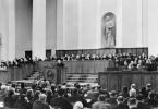
Live theme number 33. "ABC of ancestors"
REN TV broadcast from 03/11/2013
Unique archaeological finds in Kemerovo region lead to the idea that once there was a developed civilization that gave rise to the Slavic tribes and the Russian language.
Nikolai Vashkevich will tell about the connection between Russian and Arabic, as well as about the code of the universe.
1969 the village of Rzhavchik (Tisulsky district of the Kemerovo region). A marble coffin 3 m long was found, filled with a clear liquid. It perfectly preserved a woman with blond hair, blue eyes. Age - 800 million years! On the lid - unknown writing.
When the KGB took away the sarcophagus, misfortunes rained down on the village one after another. And the finder of the sarcophagus died. Only one remained as a witness, the geologist Vladimir Podreshetnikov. He says that in addition to the princess, there were other burials. In the summer of 1973, he said, troops were drawn into the area. This is confirmed archival sources KGB (according to Valery Malevany). The cordon was in 3 layers of barriers. There was a lake on the island, in the middle of which two graves were dug, which were 200 million years old!
1975 in the Chelyabinsk region
Arkaim (the city of the bear Veles from Old Slavonic)
The city of the turn of the III-II millennium BC. e., an ancient fortified structure. Smelting furnaces, blowing systems were found.
Did you get time in this city?
The Hyperborean language had a huge impact on the formation of the Proto-Slavic language, including Russian. Perhaps Hyperborean was the single language for all mankind. This language has given rise to many languages in Europe, India, Pakistan,... Many linguists believe that all people are able to understand each other, regardless of nationality and place of residence.
Mirroring of Russian and Arabic languages
magpie-thief, in Arabic saraka means to steal
Nikolay Vashkevich: Russian and Arabic have many roots. The left-hander needs to be read the other way around, we get ashwal in Arabic.
Language is the system code of the universe. The core of the code is a pair of Russian and Arabic languages. The whole world obeys this binary core. This discovery adds periodic law Mendeleev.
All Russian words and expressions of unknown origin can be easily explained using Arabic consonant words. And vice versa - Arabic concepts, even the terms of Islam, take on meaning through the Russian language and spin their own home.
For example: Caterpillar. Goose is a branch in Arabic. And if you read it the other way around - nesug - then this is a spinner. And in explanatory dictionary it is said that the caterpillar is a worm that lives on a twig and spins.
Icon of Sergei Radonezh with life. Moscow prince Dmitry Donskoy fights against Mamai's Golden Horde temnik army in the Battle of Kulikovo. Wars on both sides in the same clothes! On the flag of the Moscow army, the Arabic word dil (law). On the coins of that period, on the one hand, the Cyrillic alphabet, and on the other - Arabic script.
Russian and Arabic are close not only in form, but also in content. A shark means gluttonous, a ram means innocent, and a lark means flapping its wings without flying. These are not loanwords, as there are none in Arabic.
In Russian braid, and in Hebrew - challah. Unweave in Arabic - halla.
Two tablets with 10 commandments were given by the Lord on Mount Sinai. Perhaps on one tablet the text was in Arabic, and on the other - in Old Slavonic. In Arabic, "two languages" and "two tablets" sound almost the same.
Moses himself knocked out the 10 commandments on the tablets. Did God give them to him or did he want to teach those who worshiped the golden calf a lesson.
The Jews do not have 10 commandments, but 613. If we add the numbers to 613, we get 10.
It is generally accepted that the original text of the Old Testament was written in Hebrew. And only centuries later it was translated into Greek, Kurdish and Slavic. But why then are certain fragments of the covenant written in Aramaic? Maybe it was originally written in Aramaic?
The Bible says that on the day of the birth of Jesus Christ, the Magi Melchior, Belshazzar and Gaspar from the east came to Bethlehem, gave Jesus generous gifts. On the territory of the north-east of the Ryazan region was the country of Artania (Arsania), in which three brothers, three kings, three wise men Kasym, Kadam and Ermus ruled.
At the dawn of a new era, wise men were called sages who predicted the future by the movement of celestial bodies. And the birth of Jesus was preceded by the fall of a star, which indicated where the royal baby was. If the star is taken for a comet, then it can be found that it was clearly visible from the side of Eurasia. Therefore, the Magi who came may well be Proto-Slavs.
Jerusalem. Hiero is sacred, Salim is the sun. Since the sound is Indo-European, it can be assumed that the city was the same. It turns out that this territory was inhabited by Aryans.
external similarity. Nationality in the north of Afghanistan Kalash. They are very similar to the Russian peasant culture of the 18th-19th centuries and more ancient times. We see pigtails, blue eyes, characteristic embroidery.
Slavic writing is runic. On its basis, the Cyrillic alphabet was created. The classic runic futhark (western Europe) is different.
Sergey Alekseev: Runes are the most ancient writing. During the period there was a fairly wide period of such writing.
Therefore, it was the descendants of the Aryans - the Slavs - who were the bearers of runic writing.
Sergei Alekseev: Poem of Apollonius of Rhodes "Argonautica". Jason's Journey for the Golden Fleece. Only in Russian lamb or sheepskin called a rune. Fleece and runes are the same root words. Jason came to the Black Sea to steal writing, which was not in Ancient Greece, but it was among the Proto-Slavic peoples inhabiting the Black Sea region. If you make up the names of the members of Jason's team, then the alphabet will be found.
Something similar to the Golden Fleece was also in Persian culture. The holy scripture Avesta is written in gold on stretched bull skins. But it was burned by Alexander the Great.
It can be assumed that the Golden Fleece is the Scythian analogue of the Persian Avesta.
Sergei Alekseev: If you look at the parchment from afar, then because of the dense inscriptions between the gaps between words, it could be mistaken for a golden skin (wool).
At the time of the Argonauts, all Indo-European peoples spoke one of three languages: Persians, Proto-Slavs (Scythians, Sarmatians), Hindi. All other languages are derived from these.
Andrei Vasilchenko: One Indian researcher arrived in a remote Vologda village. At the same time, he was very surprised that, not knowing the Russian language, he understood what people were talking about. Those. the similarity remains, despite the past millennia!
Cyril and Methodius invented the alphabet in 863 on the orders of the Byzantine emperor Michael III, according to the history books.
Oleg Fomin: The Life of Cyril and Methodius says that while in Korsun (Chersonesos) Saint Constantine (Cyril's real name) found the Gospel and the Psalter written in Syrian characters, which in some sources are called Russian. He was taught these letters. Then he supplemented the alphabet with Greek symbols, such as psi, izhitsa, ... The Slavic alphabet lost 5 letters as unnecessary, as a result, 44 letters remained instead of 49.
The Sirian language (also known as Russian, Suryan, Suryan) is a language that existed on the territory of the country of Sirica. On this territory lived peoples close to who the Russians later became.
The Cyrillic alphabet was created on the basis of the features and cuts used by the ancient Russian tribes. It was just runic writing.
Andrei Vasilchenko: Many runic symbols have been preserved in the Cyrillic alphabet, which is not in the Latin alphabet.
Yaroslav the Wise, Peter the Great, Nicholas II, Lenin and Lunacharsky reduced the alphabet even more than Cyril and Methodius.
Pater Diy: The language has become ugly, people have ceased to understand what they write, where this or that word comes from.
Sergey Alekseev: Veles book - a list of more ancient source. The author translated/adapted it to the language of the 13th-14th, maximum 15th century.
All signs on the tablet of the Book of Veles are inscribed with cuts. Therefore, a person who lived in pagan Russia is unlikely to understand the meaning of these symbols. It is possible that this is a new one.
Hermann Wirth put forward the theory that in the north in ancient times there was the continent Arctogea, which was inhabited by superhuman Hyperboreans. They founded a monotheistic ancestral religion and ancestral language. He suggested that migration took place in several directions: to the territory North America and Eurasia.
Wirth told Hitler that the settlement of the ancient Aryans should be looked for in the Murmansk region. It was this that could cause an attack on the USSR. It was the caches on the territory of present-day Russia that could contain the main treasure of mankind.
Wirth died, leaving behind dozens of books on lost civilizations. But the most interesting of his materials are still classified.
Valery Chudinov: There are also only Russian inscriptions in the Egyptian tombs. Moreover, all the mummies of the pharaohs are signed in Russian, there is not a single Egyptian, hieroglyphic, hieratic, dimatic sign.
in palaces Chinese emperors and in the excavations of the most ancient structures in Europe, Russian letters are also found.
Oleg Fomin: The German city of Brandenburg is Russian Branebor, Schwerin is Zverin. Berlin is also a Russian name, it comes from a lair.
Andrei Vasilchenko: Russian is an adjective for the fact that this is a great union of peoples.
Oleg Fomin: Whoever has the memory of his origins cut off, the easier it is to manage.
p.s. For some reason, this program does not mention the Voynich manuscript, which, according to some, is written in the language in which Adam still communicated with God. Just keep in mind that the Voynich Manuscript is not a positive document at all.
From the program "Vanga. Continuation" of the cycle "We never dreamed of"
American linguist Adam Lipsius managed to decipher part of the Voynich manuscript, one of the most mysterious manuscripts XV century, the fact of the existence of a certain Supreme Magus of the Earth was revealed to the public. This creature in human form is not only able to foresee the future, but can also communicate with demons and other entities, because this is the viceroy of Satan himself!
ElmOld Russian
Orthodox arabesques
ELIM- a special decorative type of writing, linking a line into one continuous ornament in the style arabesque.
Used since the 15th century. mainly for highlighting titles, sometimes for utilitarian purposes (for example, the first type bookplates, which preceded the appearance of book signs in Western Europe by almost a century). Elm has also been used to shorten the length of headings or to deliberately make reading difficult (i.e. as cryptography). It is also found in inscriptions on dishes, bells, and also embroidered on fabrics. Occasionally, lengthy texts were written in ligature, and not just headlines.Elm is very compact and does not tolerate free space, which evenly tends to be filled with additional decorations. The direction of the letters in the line is shifted from horizontal to vertical (as a rule, the letter located at the top left is read first).
Elm originated in Byzantium in the 11th century, from where in the 13th century. moved to Bulgaria and Serbia and in the 14th century. showed up in Russia. The oldest example in Russia is the Stichar of 1380. In the 15th century. The main centers for the distribution of ligature were the Trinity-Sergius Lavra, Novgorod and Pskov. In the 16th century, the school, which was led by Metropolitan Macarius of the time of Ivan the Terrible, was famous for its ligature. Byzantine script had two varieties: vegetable (where the letters took the form of floral patterns; style arabesques) and geometric (style seafarers), in which the letters took on the outlines of geometric figures, as if reflecting the growing role of the state. The letters stretch out like Gothic cathedrals. The latter type of ligature prevailed in the Moscow principality, and the first - in Western Russia (for example, in Ukraine).

With the fall of Byzantium, the Greek and South Slavic ligature degrades, in Muscovy, on the contrary, its development continued. Moscow ligature is distinguished by lapidarity and strict proportions. It must be said that the angular Cyrillic alphabet, due to the greater number of letters with vertically oriented elements (Ts, Ch, Sh, Shch, b, b, s), is better than the Greek script and the Latin script was suitable for building up ligatures.

The concept of tie is based on the combination of several letters into one complex sign - a ligature. Ligatures can be: 1. Mast, when the letters are united by one common "mast" (trunk). 2. Ascribed and subordinate, i.e. smaller letters are separately or together attributed to the larger one. 3. Bunk - the letter is written under the letter. 4. Closed when one letter is inside another. 5. Semi-closed. 6. Dotted - a group of letters touch at a single point. 7. Crossed - two letters intersect each other. 8. Title ones, when a special sign “titlo” ҃ is placed at the place where the letters are skipped. Titles abbreviate the most commonly used words. The spelling of title ligatures, as a rule, did not allow variations: bg - god, btsa - virgin, dh - spirit, tsr - king, sty - saint, numbers 71 - oa, etc. Moscow calligraphers brought some innovations to the theory of tie, which predetermined its further development; 9. Crushing of the common mast, 10. Hanging letters, i.e. the letter acquired additional elements, filling the space surrounding it as much as possible. 11. Spaced letters - the letters were stretched, and their horizontal elements were shifted to the edges of the mast. At the same time, the horizontal lines of the letters were much thinner (almost invisible) compared to the vertical ones. 12. The violation of symmetry changed some letters beyond recognition. Remote signs were widely used in knitting (see. Cursive).

The letters of Russian ligature, as it developed, gradually stretched out. The ratio of their length and width could be 3:1 (Byzantine script), 15th century. and 12:1 to con. 17th century Such proportions of the ligature significantly hampered reading, which was sometimes used in ancient Russian cryptography, since it no longer demonstrated just decorative techniques, but revealed the properties of a puzzle.
Some letters (A, C, O) could change beyond recognition:
In ligature, techniques were developed that largely freed from the duality of reading:
1. Mast crushing:
Such crushing made it possible to increase the number of ligatures:
2. Suspended ligature, when the letter seems to hang between the upper and lower limits on several "legs".

3. Letter spacing. To bring two graphemes as close as possible, oblique or horizontal elements are flattened to the bottom and top:

In this case, side elements can freely move vertically, sometimes taking unusual shapes. Compare metamorphosis L:
Sometimes the symmetry of letters can be broken:

Knitted letters were sometimes decorated with decorative elements such as a knot, a cross, a leaf, an arrow, a figure eight, dashes, curls, dots, rhombuses, proboscis, hangings, etc. Here are some types of patterned elements that were used by craftsmen for beauty.
1. A knot (it can also be hollow), which was usually placed in the thinnest places of the grapheme:
2. Oblique cross:
4. Leaves (symmetrical and lateral):
5. Arrow:
6. Eight:
7. Dashes can be used two, three or more, as well as in combination with other elements (for example, with a knot):
8. Curl: moreover, the curl may be accompanied by dashes or dots
10. Double Diamond:
11. Cross in a rhombus:
12. Curls in a circle:
13 Triangle:
14. Web:
Sometimes it is difficult to distinguish patterns that mean nothing and serve only to fill the free space from elements of letters (or even letters themselves) made in the form of patterns.
![]() Here the curl is undoubtedly a continuation of the letter.
Here the curl is undoubtedly a continuation of the letter.
And here the whole letter is entirely made in the form of a complex curl.
 Calligraphers especially like to decorate Ѡ, V, ȣ
After the church reform of Nikon and the Europeanization of the country by Peter I, the ligature is going through a period of decline and today it is actively used only among Old Believers, in particular Pomors(Arkhangelsk region) in their books of the 18th-19th centuries. They brought some new elements to the knitting technique. There are no circles in the Pomeranian script, it is even more angular, which allows the formation of previously unthinkable ligatures resembling a web (they are barely accessible to parsing).
Today, primitive variants of knitting are used by the national-patriotic movements of Russia, for example, "Memory".

1 - bookplate; 2 - Synodik, 1659 ("the spelling of the senadic was collected"); 3 - Russian gospel of the 15th century, from the Serbian original ("in the holy and great week ... the gospel"); 4 - Ukrainian ligature ("preface and fairy tale to..."); 5 - Letter of the 14th century. Bulgarian Tsar John Shishman. Royal title ("Ioan Shishman. In Christ, both the tsar and the autocrat of all the Bulgarians and the Greeks are faithful"); 6 - Novgorod Gospel of the 16th century. ("from John the holy gospel").
 Pskov Chrysostom 16th century ("the book is said to be instructive Gold ...")
 Maxim Grek, 1587 ("this word was created by a monk")
 Life of Valaam Khutynsky, 1689 ("at the great party...")
 Apocalypse con. 19th century ("the revelation of the fourth seal is in the water...")
 Secret writing 19th century
|
|

Let's analyze the superscripts in the inscription “Russian-headed Code of Laws on Rose Courts” 1 - accent mark; 2 - a separating sign placed between two consonants; 3 - the letter "k", covered with a title-like sign; 4 - the letter "s", covered with a title (5); 6 - title; 7 - combined sign "th"; 8 - separating sign (see 2); 9 - stress; 10 cm 2; 11-pronged letter "x"; 12-accent; 13 cm eleven.
The technique of "tying" decorative ligatures is inherent not only in Cyrillic, but also in many other oriental writing systems. Following the example of the Byzantines, ligature ornaments were used in Georgian, Armenian, Coptic scripts, as well as in Glagolitic manuscripts and runic cryptography.
The elm is widely used in Arabic, Syriac, and some Indian (Nepali Ranja) scripts. Korean writing is originally based on ligature-syllabic spellings

Selishchev A.M. , Old Slavonic language, M., 1951; Cherepnin L.V. , Russian paleography, M., 1956; Shchepkin V.N. , Russian paleography, M. ,
As far back as the Paleolithic period, mankind has known the art of ornamentation. Valuable information was invested in a repeating pattern. Such an image is capable of evoking associations that are intertwined with each other, helping to understand the full depth of the work.
Ancient Slavic culture in patterns and ornaments
They have absorbed many sacred, magical meanings, have a special energy. Magi used signs for sacraments and rituals. With their help, shamans could erase the boundaries between worlds and travel to a dark or light world, communicate with the gods, pay tribute and respect to the forces of nature. A man who lived among nature continuously watched her, transferred her lines to fabric, dishes, household items. Each line was non-random and endowed with its own meaning. The ornament helped the ancient Slavs to protect their homes, themselves and their families; for this, patterns were applied to window and entrance openings, clothes, towels.
Traditional colors in symbolism
The ornament was applied to clothes with special trepidation, as it protected the one who wears it from evil spirits. The ritual pattern was applied to vulnerable parts: neck, collar, hem, sleeves.
Red
Most of the embroidery was red, as a symbol of life and love. This color protects the living. Red is also a sign of energy, fire, that is, the sun. He gives a healthy body, warmth, removes any evil eye.
It is not for nothing that ordinary phenomena were endowed with the epithet “red”: the red sun, which gives life to all living organisms; spring is red - the personification of the beginning of life; red summer - dawn, life triumphs; red girl - beautiful girl, healthy, full of energy etc.
Black
In combination with red, it enhanced the protective effect of the ornament. Black is the fertile Mother Earth, this color was assigned the role of protecting a woman from infertility.
The sign, embroidered in a black zigzag, means an unplowed field, it was worn by girls who need to be fertilized. Wavy black lines - a plowed field, ready for the grains to germinate, that is, for fertilization.
Blue
The blue color protected from bad weather and natural elements. It was used mainly on men's clothing, because it was the man who was often away from home, getting food or being at war. Blue water is the sky on earth, its reflection. The blue embroidered ornament on the man's dress tells us that he embarked on the spiritual path of self-improvement.
Male color, a sign of readiness to protect a woman. If a young man gave a girl a blue embroidered handkerchief, this meant that he had the most serious intentions, he was ready to protect his chosen one for the rest of his life. An important point: the man himself necessarily tied a gift on the head of the girl, thereby confirming his intentions.
Green
The green color was endowed with the power of plants and helped protect the body from wounds. Symbol of the Forest, youth and rebirth. Green depicted the World Tree, sown fields and young shoots.
The Slavs had names: - a green garden meant blooming life; - the deep sea is green, the same as "beyond distant lands", very far away; - green wine had a negative connotation - strong alcohol intoxication. But, at the same time, this color denoted the space of a stranger, places inhabited by evil spirits.
In the southern area, the Slavs had conspiracies that helped drive out evil spirits on the “green grass”, “green tree”, “on the green mountain”. Mythological heroes also had green parts of the body: the hair and eyes of a mermaid and a goblin, and the merman himself was all the color of sea mud.
White
The dual color is white. It is associated with everything pure, bright, holy, but at the same time it was considered mourning. Any other color is combined with this color, so white is a symbol of harmony, reconciliation. Also, white light is the space that is intended for human life.
People with pure thoughts and bright thoughts were described as follows: white hands, white face, white birch tree. Everything that is sincere, bright and kind in the world, everything is reflected in white: - white tablecloths protect guests from evil thoughts; - white sheets protect from death; - white underwear creates a barrier to grief and illness; - a white apron is able to protect the female organs from the evil eye.
Slavic symbols and their meaning
Alatyr Another name is the cross of Svarog, an eight-petal star. This is the Eye of the Family. It was applied to the clothes of people in charge, the sign acted as a talisman on a dangerous and long journey. The cross combines all svargas, two-headed and triglavic and many other sacred symbols, as it is the basis of all things.
Bereginya
This symbol has many names: Rozhanitsa, Mother of the world, Goddess of the house and others. She protects her entire family, family, hearth, children. Beregina is allowed to host in heaven, in nature, she was responsible for fertility. The female image was embroidered with raised or lowered hands as a sign of a talisman and blessing.
The embodiment of the Universe, the center and axis of the world, the personification of the entire Genus. Women, so that the family is strong and healthy. In the minds of the Slavs, the place of the World Tree was given in the center of the world, in the middle of the ocean on an island of land. Branches stretch to the sky, gods and angels sit in the crown. And the roots go deep underground, to the Underworld, where demonic entities, demons live. Bereginya and the Tree of Knowledge were interchangeable. Often the Goddess of the house was depicted with roots instead of legs - a sign of the earth.
Kolovrat
The well-known sign of the swastika originates from the Slavic peoples (it acquired a negative meaning thanks to Hitler and the Nazi army). Kolovrat, or Solstice, is the most ancient and deeply revered pagan amulet. It was considered the most powerful protective sign, which personifies the unity of the Family, its continuity, the Rotation of everything and everything. Thus, the idea of the Eternal Revival received a symbolic embodiment.
In the direction of rotation of the swastika (salting / anti-salting) determine the Sun in summer and winter. The aspiration along the course of the sun (Reveal) is bright, it is a Creative force, a kind of symbol of energy control, superiority over existing matter. She is opposed to the left-sided swastika (Sun of Navi), this is the triumph of everything earthly, the superiority of the material essence and instinctiveness of things.
Undoubtedly, the most common were the symbols that brought happiness. Orepey (or Arepey) is one of them. The comb rhombus received this name in the Ryazan region. In other regions, it is known as oak, well or burdock. The rhombus itself in the Slavic ornamental tradition has many interpretations: agriculture, fertility, it was believed that it was also feminine, the sun.
A sign with a dot in it meant land planted with seeds. On the robe of a woman in the shoulder area, Orepey denoted the World Mountain, Alatyr-stone with a god sitting on it. Gates to another world were embroidered on the hem. On the elbow means ancestor. Often the rhombus pattern ended with crosses. So the Slavs believed that they spread happiness and good on all four sides. The symbol of a sown field brought prosperity, success, wealth to the Slavs, increased vitality, gave a person self-confidence.
Thunderbolt
The sign of Perun (the god of thunder) was depicted as a cross with six ends, which was inscribed in a hexagon or circle. At first, only men could use it and exclusively in a military environment; it was depicted on the weapons and armor of warriors. It was believed that Thunderbolt had a detrimental effect on female energy. Later, the ornament began to be applied to simple clothes and dwellings in order to protect themselves from destructive lightning. Often this sign was decorated with shutters and door jambs.
Makosh
The Heavenly Mother of God is the arbiter of destinies. With her daughters, Shares and Nedolya, she weaves the threads of fate for gods and people. Those who adhere to a righteous lifestyle, honor the saints, know the canons, draw a good lot, and Makosh gives them a Share, good fortune. For those people who follow their desires and selfishness, Nedolya will be the mistress of fate. Makosh patronizes fertility, women's handicrafts, on her shoulders is the responsibility for the crossroads of the Interworld.
The symbol helps to call for help the power of the gods, it protects, heals, helps to find harmony and happiness. A noose-like sign is able to connect torn, confused and broken parts into a single whole.
Water
Water acted not only as an element, it is knowledge, the beginning of which is in the Interworld. The personification of the Currant River, which serves as the border between Yavu and Naviu, a river that carries the knowledge of ancient ancestors, oblivion and death. The river Ra is a bright road to God. Brings knowledge top level and the milk river in Iria grants immortality.
A strong amulet, personifying the union of two Clans. This ornament was always present in wedding embroidery. The pattern means the eternal spiritual, mental and physical merging of entities: two newlyweds and two Clans. The threads of the Body, Soul, Spirit, Conscience of both Clans are intertwined into a new created Life System.
Strong and weak beginnings in the wedding are indicated by color: male - red (fire), female - blue (water). The unification of the energies of the two Elements generates a new universal energy and is a manifestation of infinite life in time and space.
fireworks
In the culture of the ancient Slavs, Ognevitsa was a strong female amulet. A beneficial effect was only on a mature female body and a formed soul. The presence of this image on the clothes of young girls and girls was not allowed. Ognevitsa effectively acted on married women who gave birth to at least one child. She protected from everything bad, starting from a random word and ending with purposeful evil deeds.
Carrying a sacred meaning, Ognevitsa was embroidered only on clothes, you will not find it on household items. This symbol is able to take away any trouble from a woman, direct her to positive aspirations. Slavets often performs in tandem with her - a swastika solar symbol that helps protect women's health. The Slavs knew that Ognevitsa enhances the action of the energy flows of the protective symbols that are next to her.
Stribozhich
Stribozhich directs his creative energy to protect against the elements (hurricane, snowstorm, storm, drought, and others). The amulet gave immunity to the entire Family and the Household of the Family. Sailors also loved this symbol. They carved signs on sailing ships, and Stribozhich gave them good weather. He was revered by farmers and farmers. Embroidered on work clothes, the pattern called for a cool breeze in the hot midday heat. There is an opinion that the blades of windmills were built in accordance with the location of the petals of the symbol. This allowed the most efficient use of wind energy.
The Slavs attached great importance to the color scheme. The red blades of the sign are solar energy, activity. The inner space of white color means unity with the Universal heavens, the place where energy originates. External blue color speaks of sacredness, higher level spiritual development. This wisdom is not given to everyone, it is given only to the elect.
Spiral
The spiral is a sign of wisdom. Pattern of blue color meant sacred wisdom. The ornament, made in other colors, was a talisman against evil forces and the evil eye. Slavic women loved to embroider spiral images on their headdresses.
The spiral itself is the oldest symbol of the Universe, because many galaxies are arranged according to this principle. And mankind since ancient times has been developing in an upward spiral.
A little more about symbols
It is possible to comprehend the beauty of the protective Slavic symbols if you study their meanings. Watching the patterned embroidery, considering the bizarre interweaving of ornaments, the eye loses focus, and the picture becomes "holographic". Attention switches between dark and light signs. Where the dark is all earthly, and the light is the heavenly world.
In order to decipher the meaning inherent in the patterns, it is necessary to take into account the fact that, depending on the location of the protective symbolism on the clothes, its interpretation also changes. The Slavs accepted a three-part division of the world: Yav, Nav and the world, where a place is reserved for man. Accordingly: the neck, the shoulders are the highest divine light, the hem is the Underworld, the sleeves are the middle human world.
By placing one sign in different worlds, it took on different meanings. Masculine and feminine, light and darkness, earth and sky, top and bottom - such opposites ultimately lead to the fact that the process of movement, development occurs continuously and forever.
The ancient Slavs had to observe golden mean to keep the two sides of the force in balance. Symbols have been created and improved over the centuries, they have absorbed special sacred meanings, magic, works of ancestors. These are strong protective amulets, so their beauty and aesthetics should be judged last. For a very long time, the masters honored the canons according to which the ornament was embroidered, they knew the meaning. But by the beginning of the twentieth century, much was lost.
Modern embroiderers can no longer explain what they embroider, but somewhere in the distant outback the most ancient patterns still live and delight their admirers. There are still people who consciously wear protective clothing, delving into and comprehending the secrets of the past.
Slavic costume has always been admired by overseas merchants. Clothes skillfully emphasized external and spiritual beauty. The rhythm of geometric details plays a significant role. To know the truth, to feel harmony and splendor is possible through creativity. However, you should not look at the mysterious ornament on the run. This requires a special mood, a spiritual attitude, when a person hears his heart and is ready to follow his call.